Sparkum Web App
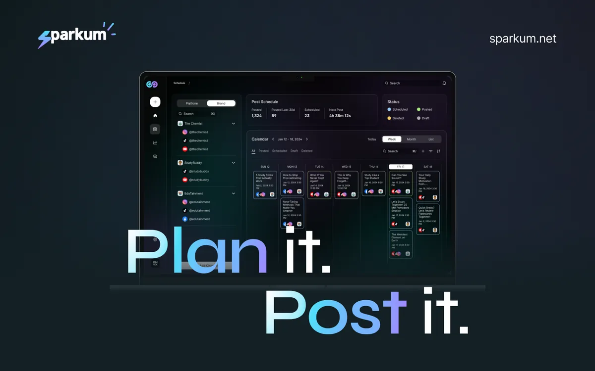
A full redesign of an all-in-one social media app, built on a new design system that turned an inconsistent product into one that feels clean, fun and easy to use.
Overview
Sparkum lets people manage all their social media in one place: post content to every platform, see what's performing well and what isn't, and engage with followers across platforms, without juggling a dozen tabs.
After redesigning the Sparkum marketing website, I moved on to the product itself. Every screen in the app today is my design.
The problem
The old app looked very different from what it is now. It was full of inconsistencies: screens and components didn't feel like they belonged to the same product. That made the app harder to use and harder to grow, because every new screen added more mismatches.
The app needed a solid foundation, not just new screens.
My role
I was the only designer on the app, working directly with the founder. I:
- Built a new design system for the product
- Designed every screen in the app as it exists today
- Carried the fun, approachable look of the marketing site into the product
Process
- Audited the old app. I went through the existing product and found the inconsistencies that needed fixing.
- Built the design system first. Instead of patching screens one by one, I created a consistent set of styles and components to build everything from.
- Redesigned every screen. Using the design system, I designed all of the app's screens so they look and behave the same way.
- Iterated with the founder. We reviewed designs together and often found better approaches, refining the app round by round.
Key decisions
A design system before screens.
Fixing the root cause meant building one shared system, so every screen stays consistent now and as the app grows.
Intentional, not decorative.
Every design decision had a reason behind it. Nothing was added just to look nice.
Fun and user-friendly.
Social media tools can feel heavy and technical. I kept the app friendly and enjoyable to use, so it works for anyone, not only experts. That balance brought out the best in the product.
Challenges
As with the website, the main challenge was design iteration. We often agreed on a direction, then found a better one while reviewing. Working through those rounds together shaped a stronger final product.
Results
- Every screen in the app is designed on one consistent design system.
- The app is fully functional and ready for real users.
- It's a product I'm proud of, and it's live at app.sparkum.net.
What I learned
Fixing an inconsistent product starts with the foundation, not the screens. Building the design system first meant every screen after it was faster to design and stayed consistent. Designing a whole app on my own also taught me to make every decision intentional, because in a product, small details add up to how it feels to use.
Let's build something
Tell me a little about your project and I'll get back to you.
Get in touch